Slainte part 1
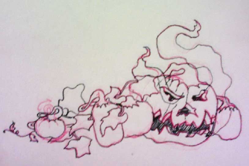
 Here's an in-progress view for a St. Patrick's Day illustration I'm making this year. Inset below is the basic thumbnail I began from and the first larger sized plan I put together for the next set. I definitely wanted to keep the diagonal direction in there but wasn't sure yet how to handle the lettering. There were a lot of ways to go with the type.
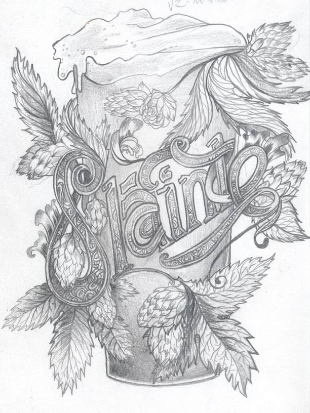
In the next version I have more of a plan for the composition and the diagonal the lettering is resting on. I have a couple of things left to puzzle out but I'm far enough along to bring it into the computer to process and adjust.
Since this is so complicated I will think about using limited colors and sticking with richer shades of green, red, gold, and brown. In ornate illustrations - like in illuminated manuscripts - I notice that some level of order helps to balance organic elements. I think the same idea can help here.