Doodle mugs, and a new store
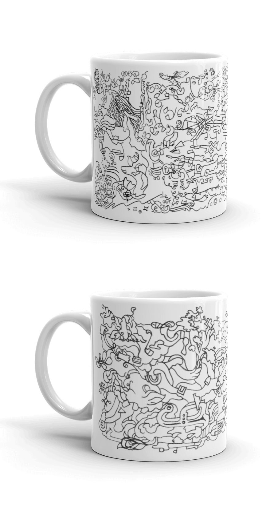 I've been experimenting with making products lately. Here's a couple of mugs I made. These are available in the store. I have had a number of ideas for posters and apparel and have been working on turning some of these into products.
Creating the products has been more difficult than setting up the store. It's pretty hassle-free to set up a payment gateway these days, especially if you use Wordpress. If you're an illustrator or artist who wants some help setting up a shop online send me an email or a message on twitter.
 Here they are separately:
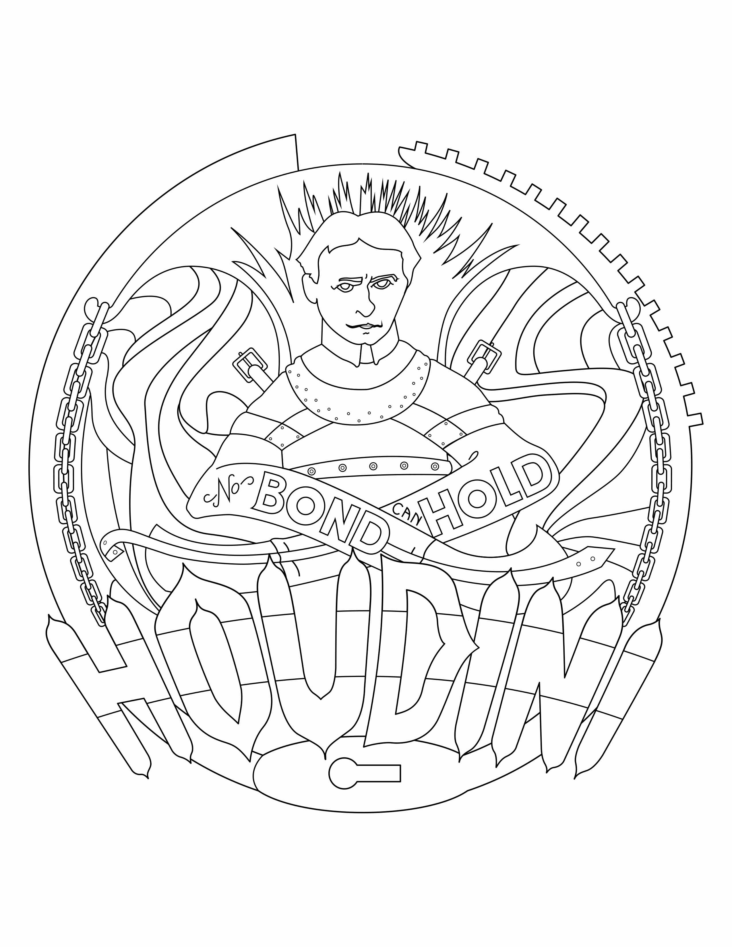
 I have everything brought into Illustrator, now I'm working on detail and colors. You can see in the letters that there are breaks to help me see where there will be depth in the letters.

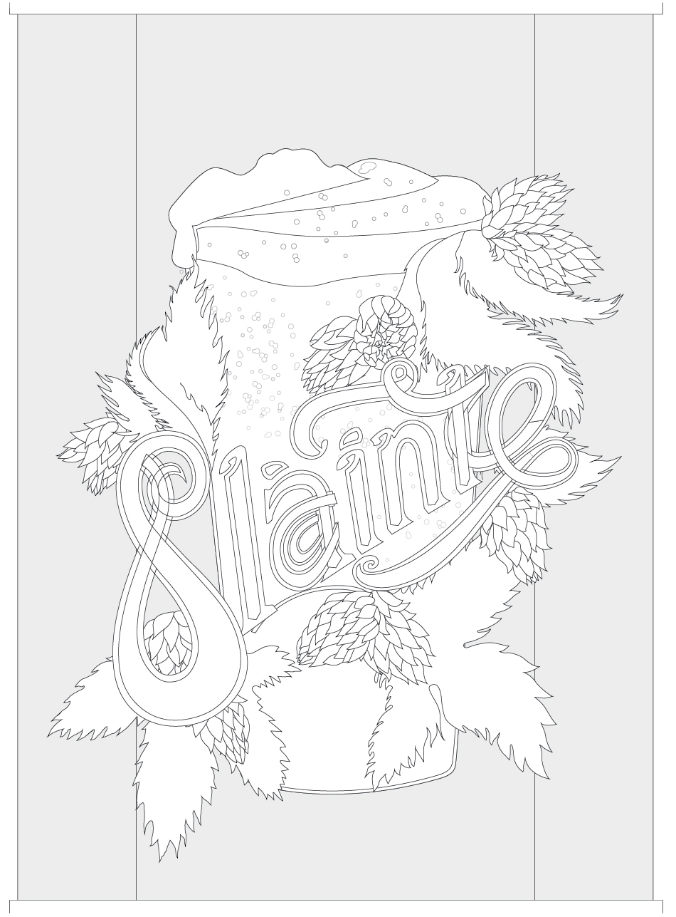
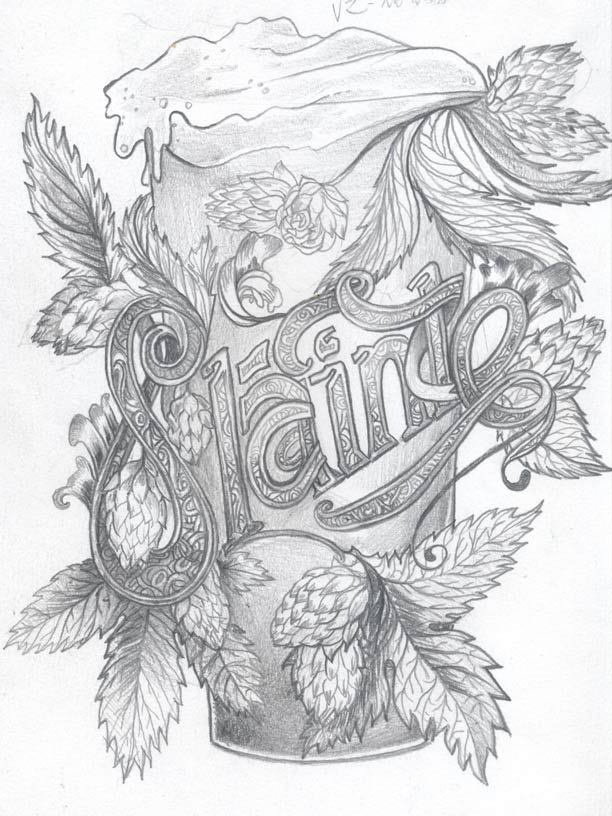 Here's an in-progress view for a St. Patrick's Day illustration I'm making this year. Inset below is the basic thumbnail I began from and the first larger sized plan I put together for the next set. I definitely wanted to keep the diagonal direction in there but wasn't sure yet how to handle the lettering. There were a lot of ways to go with the type.
