Design

Design

Common problems in responsive websites

Common problems in responsive websites

responsive-sitesI can speak for all designers when I say that the acceptance of responsive design is a huge step in the right direction. Mobile views are where users are and will continue to be if the trend continues.

There are some things to watch out for when making a site responsive before calling it "done", and all can be found by testing. Here are a few things that keep showing up in sites I see, and ways to fix each problem.

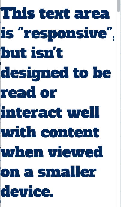
Type bloat. This is the first sign that the site still needs to be adjusted, or was built with mobile as an afterthought. Text that looks fine with lots of space on the left and right in a wide column becomes stuffy on a mobile device unless type is given room to fit the space.

The solution is to look at it on a small device. When a smaller phone isn't available, I try to simulate what a site would be like for someone on an early smartphone to help content stay legible.

Sorry, mobile users.
Stuffy, bloated text in mobile view.

The order of content. You have multiple columns on a desktop, but if you design on the desktop to start, what will happen to your site in one column? If you have ads on the right, will they appear on top of your site's content or at the end - or should they show up at all?

The solution for each situation is different but the first step is testing the page to make sure elements flow throughout in an expected way (unless you want to design with mobile first and head this problem off sooner).

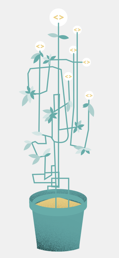
Speed loss from frameworks. Many designers like Bootstrap, Foundation, etc. for the way they make getting a site together quickly. The biggest trouble (besides sites looking the same) is that so much of the code is unused by your site at the end of the project. Every visitor to your page will have to call on the entire framework to load a few elements for your site to appear. It can affect their data usage and your site's speed.

To help counteract this you can use a framework in the mockup stage and build the site with only what you need. Keeping the framework handy as a mockup tool will allow you to revisit areas in the future without the need for the entire framework at once.

Web-friendly images. The most common way to slow down a site is to keep pictures larger than needed. Stock photo sites, cameras and our (sometimes) fast connections are to blame here. If they load quickly for us, why should we think otherwise for a site? Unfortunately, unreliable internet speeds keep this a problem.

Web safe images can help. Photoshop's "save for web" is a fairly easy way to see the file size of your image while comparing quality. Be careful to provide images for retina displays as well if needed. There are some methods of providing images to viewers based on CSS but none as easy as "save for web" right now.

This might seem like a lot, but it adds up to a better site for your visitors and is well worth the effort.

If you need help, send me a message and I can help keep your site looking good and loading quickly.

Growing and improving with web standards

Growing and improving with web standards

web-standards

Many designers are self taught and self teaching. There are always improvements and changes in web standards to incorporate into practice. This pace is overwhelming at times, and everyone experiences this once in a while. If you're new to dealing with web standards you might feel frustration on a regular basis. Fortunately, the systems in place for learning and keeping our cool are as relevant as ever. Let's look at a few mindsets you might experience and how to deal with them.

Problem mindsets:

Impostor syndrome: If you have ever felt like you fooled your way into the project and everyone is smarter than you, blame this mindset bias. Every designer and developer has felt this way at some point. It is also important to remember that everyone is at a different level of learning. There is no "yes/no" impostor state.

Comparison: Another way to hit the wall is by comparing where you are with other designers to the detriment of your learning. I believe a level of comparison helps us to learn and gain perspective but if it gets out of hand can cause you to rethink too much of your work.

All or nothing thinking: This is an easy one to run into thanks to the level of information that exists for the self teaching designer. Trying to understand everything at once is sure to make you feel overwhelmed.

Solutions:

Resign to not knowing (yet). Every time I feel overwhelmed this is step one to restarting. No designer has a grasp on everything happening with the web. Allow the reality of learning to settle back into your practice and make progress at your pace.

The web is resilient. When you're learning, you will discover that the way you have been working isn't quite up to date anymore and you have outdated pages on the web. Relax - there are some very old pages online that are still legible. Some newer features for the web aren't even used much until browsers "catch up" with compatibility. That said, your old pages are an excellent chance to bring new learning into practice. Updating old work is a chance to learn, not another problem.

Measure your progress. This is something I do to keep myself on track. By comparing yourself now to where you were last week you can see progress or identity problems instead of feeling overwhelmed by an unhelpful mindset. Identifying what you don't know is a good first step to learning.

Finally, go take a walk. That fixes everything you can't process yet.

There are more problem mindsets - and ways of dealing - than I mentioned. Leave a comment to talk about how you handle it.

Why WordPress works for small business

Why WordPress works for small business

wordpressFor a business new to the web, I often point to Wordpress as the content manager for their site. Here are some reasons:

Wordpress is easy to install and learn for for people at all skill levels. Wordpress is compatible with every hosting company at this point, and installs in minutes on a hosting account. There are also default themes to help you get started.

The admin area, or dashboard, is easy to understand. I have worked with people who only use email and Word on their computers and they quickly pick up Wordpress. On the administrative side, I can hide areas of the site that are more technical for users who aren’t comfortable around the entire dashboard.

Low cost (free to install). Wordpress is one of the most widely used content managers on the market today. There has been consistent community involvement of the development of Wordpress through plugins and addons, as well as providing support on Wordpress forums.

Lots of plugins. The additions made by the community through plugins are invaluable. Wordpress can bring in contact forms, connect with your analytics account, publish to your social media account when posts are made, help you sell items, adjust SEO to your site and more.

Safe and easy to backup. This comes at a caveat: As long as Wordpress is updated it’s fairly safe, and there are many plugins to help extend this security as needed. The catch is that keeping Wordpress updates from installing can put a site at risk. I notice that Wordpress support offers updates on a regular basis to help prevent trouble before it starts.

Customization. This is one of the biggest reasons I like working with Wordpress. Sites like Squarespace and Wix have some customization in their templates but can suffer from homogenous design since settings are limited by the content manager. Wordpress allows for more flexibility to create unique sites. Part of my job as a designer is to help a business stand out, and customization is an important aspect to making a great website. The catch is with that level of customization available, the technical requirement increases as well - meaning learning a little HTML and CSS.

A summary:

Squarespace/Wix: Greater monthly cost, less flexibility/easy to update, needs less maintenance

Wordpress: Greater learning curve, needs more maintenance/most cost is upfront(DIY can be free), more design options

➽ If you need help with a content manager regardless of the service let me know.
Are you a designer or an artist?

Are you a designer or an artist?

Yesterday I talked about design as a service. The idea is that you are not designing to be creative, you're making something that helps other people to communicate more clearly. That's a good definition of design.

art-timeChances are, these can send you to places where you might not feel like you are doing your most creative work. If you're like me, you chose a path in design because you enjoy art in general. In your day to day work it isn't certain that you will find an intersection between design and art you want to make. You can end up in a creative field and are not creatively challenging yourself if you're not careful. This can lead to frustration, feeling less creative and ultimately delivering work that isn't your best. How do you handle this?

Punch out of your design job once in a while and make art.

That's really it. Here are some reasons:

Creativity in art can influence your design thinking. The exploratory process of making art is a good practice for when creative solutions are needed in design. Science supports this idea. I'm out of my element with the science behind this but thinking creatively in art will support creativity elsewhere.

Remind yourself of the difference between art and design. Art is expression and design is communication. If you're making art outside of design work you will be "scratching an itch" so to speak. This allows you to include art as needed in design, instead of needing to include art in design.

There is room to be creative in design and you need to be ready to deliver - it's part of why you're qualified to do this work. When we are being creative we grow more than when we feel that our work is repetitive. Challenge yourself. If the work you are doing isn't challenging to you then you might not be giving it what you are able.

If you are an art-friendly designer and want to start a practice, today is a good day to begin. Creative Sprint starts today, 30 days of ideas for being creative. I'll be doing it as well.

There are many more benefits to making art outside of your original profession. I encourage you to find them - for your sake and for the sake of your work.

A flexible outline for branding

A flexible outline for branding

If you're a new designer starting a logo, here's an outline you can use to begin the process. I kept this vague because the idea is for you to tailor your service to support your work but this outline will be a good beginning.

1) Explain yourself

One of the biggest fears I encounter from clients is the thought that hiring one person "locks" them into fewer choices and they might be stuck with something they don't want. It is your job to help assuage uncertainty by having a process that incorporates discussion and rationale for choices. By explaining this process you can show your capabilities and eliminate the thinking of design as a lottery or contest where the outcome *might* be positive. A process has the greatest chance of success. Design is a service, not a contest.

2) Ask questions, and be responsive

By now you have heard a fair amount about the business but it's is the time to learn more. You aren't just learning about the client's service but the industry in general: trends, competition, biggest concerns, their customers, concerns of their customer, shirt color of their customers, everything about their customers. You're trying to appeal to your client's customers - not just your client. Remember this and imagine you're working for two now (your clients and their customers). How would their customers view the work you've done?

3) Research

Research is separate from asking questions because it includes what you might not hear from your client. There are things they might not know or forget to consider but your fresh perspective will help to find those things out. If there's nothing new to learn from here that's great, but be careful that you haven't simply missed something. Stay open.

4) Start loose

Now you can take your research and fulfill the promise you talked about in your outline to the client. Start working loosely. You're in the idea stage if you haven't started there yet. Don't make one idea precious. Nothing perfect, please.

5) Refine over time

Refining is where the vague takes shape and a logo comes to be. Think of a tree trunk - wide at the bottom and narrow at the top. I limit revisions because we're working toward a goal and changing elements because of too much feedback can pull us out of designing with intent and into designing to be finished. All that research is meant to guide your choices. This part of the project looks different for everyone and is a good time for your client to learn about how you work.

6) Arrive at a final, prepare files and stay helpful.

Arriving at the final logo means you tested your work at different sizes, limited color situations, and in the most difficult instances you can imagine. This can be: crammed onto the back of a t-shirt next to a dozen other logos or printed on a small one color newspaper ad. Prepare for the worst and make sure the files you send can minimize problems. Label/organize your files clearly and imagine you won't be the designer working with the logo in the future. Imagine there won't be a designer - make them easy to understand for everyone.

7) Remember your purpose a.k.a. design is a service

This is the step that exists within the rest of the steps. It is important to remember that you are not making art here (save that for later) you are providing a service. Be accessible, helpful, and open. Don't design in secret, and if you do record the process to help explain your choices.
Houdini – colored

Houdini – colored

I colored this myself (download a page to color here) looking at posters from Houdini's era. Lots of art deco, airbrushed shapes and textures began showing up in what I found. One of the more interesting things I learned about Houdini is that he insisted on explaining to his audience that superstition and magic have no part in his performance. "My brain is the key that sets me free" - Harry Houdini.
HD-small-web
Slainte part 3

Slainte part 3

Here's the final version of the poster. I pulled heavily from art nouveau to make this so complicated lines are ok here. It is easy to overwork a project sometimes and my original idea of working line art into the lettering took it to that point - so I left it out in the final. Sl-final